How we embedded accessibility in our new website
We talk to the woman behind the website, Rosa ter Kuile, about her experience of building our brand new website from scratch with accessibility at the forefront.
Wait, i liked your old website? What happened?
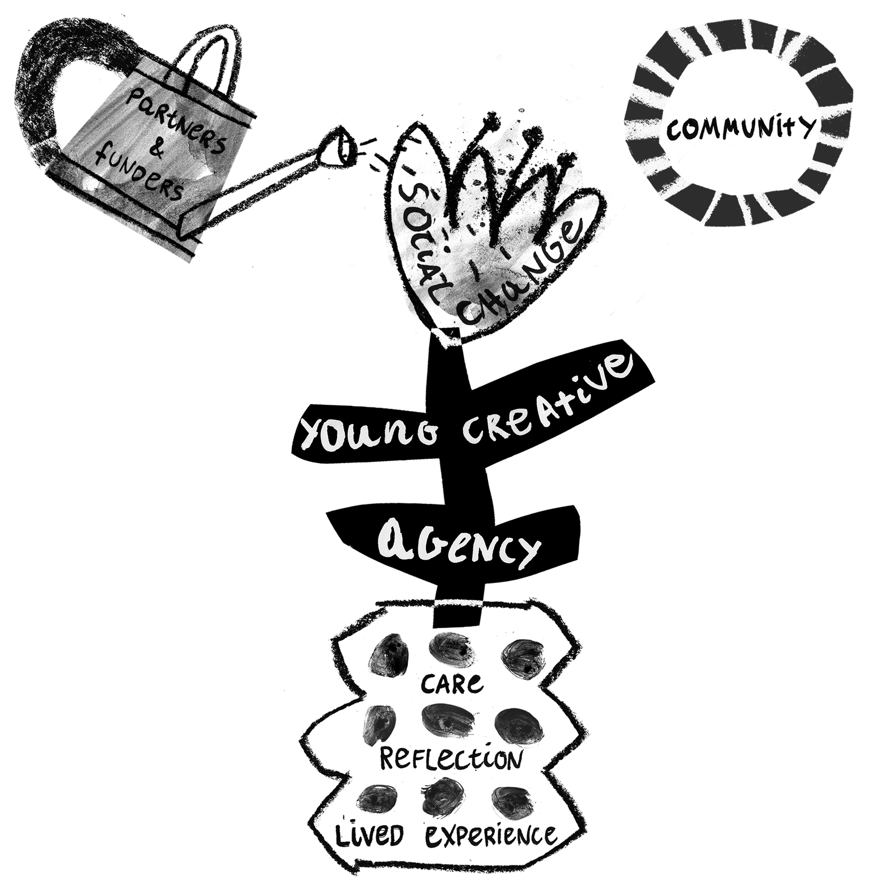
Rising doesn’t do one thing, and that complexity is part of its beauty. But it also presents a challenge to communicate our what, why and how to all our audiences. Our old website felt like it was trying to do too many things at once, so we set out on a long winding road to change that.
The purpose of our website has changed a lot since our beginnings. When we started it was important to create a ‘portfolio’ space for our artists. Social media totally changed that need - and it wasn’t using our time well to try to keep each portfolio up to date. So now our website is a place to feature the work we produce together, and highlight the artists involved. Check out our Selected Work to see it in action.
Rising has always been community focussed. That has not changed - we still wanted to show the diversity of our community, the incredible artistry and skills. We just wanted to show it better!
What access considerations did we implement?
Design v Access:
Making the website accessible was our grounding principle for this project. We consulted with access hotty Ant Lightfoot who conducted interviews with our community. From this, we addressed their questions to highlight “how does the community work”, “how to do i join”, “when do i leave?” “what do i get out of being in the community”. Ant helped us figure out how to make these things more explicit.
We considered the impact of bright colour and ALL CAPS text. Our branding (designed by Patwa) is purposefully bold, so we needed to find a balance between how to make bright yellow and black less intense, but still hold on to our recognisable visual language.
So we made compromises. We removed sexy but unnecessary moving parts on the website, minimised long sentences in ALL CAPS as well as provided Easy Read documents for each main navigation page, alongside a customisable access tool (more about these below).
‘Easy read’ documents:
Click on the ‘easy read’ icon on each page and you’ll find the information of our website without the bells and whistles of photos and longer paragraphs. Across our website we still try to condense our message into bullet points wherever we can.
Access tool:
We also implemented an accessibility tool which enables visitors to select access options according to their own needs (e.g. pause animations, make text larger, etc). Check out the blue ‘Accessibility’ button at the bottom right of your screen.
Image descriptions with vibe:
We try to bring our voice to the alt-text descriptions of our images, so that each visitor depending on their need can get the same vibe from us. So instead of using th bland description “person smiling’, we might instead use “person laughing like they’ve just seen their bestie”. This is so that everyone can know how badass our community are in their photos. If you find some that don’t have alt text, please let us know.
Bespoke art and visuals:
We commissioned two Rising artists – Martyna Gradziel and Jade Harding – to create artwork that helped explain what we do visually. We also use video and audio a lot more particularly on blog posts so people can access the information in a format that suits them.

Why does it matter?
On a basic level we now have a home where all the different things we do are more explicit and accessible, and how you can be part of it.
Share resources:
We also wanted to share more of our free resources for young creatives and partners to get a taster of our work. This includes our ‘what we’re thinking about’ newsletters that talk about the deeper themes of our work, which can now live on our blog.
Consolidate our branding:
And from a more practical point of view we’re now using our actual brand font!! This honestly makes my branding heart sing. And if you ever get to poke around the backend you’ve honestly never seen image folders more beautifully organised.
NOW this is done, what’s next for you?
This project has been my focus for the past year and it’s time for me to lay down my creative tools at Rising HQ. I’ll still be making various things freelance, so go follow me @rtiiika

Thank you for reading this. If you want to support us to embed accessibility across the sector and beyond, please consider joining the Rising Alliance or increasing your regular donation.