Behind the design of #WhoseFuture with Ash Kayser

photo of Ash Kayser smiling
The #WhoseFuture campaign launched today and you may have noticed the 'wiggly lines' and differences to last years aesthetic.
Here we learn more about Ash Kayser's inspiration, working with the Rising team on the overall design of the campaign.
You can find more of his work here.
Can you tell us a bit more about what’s behind the design?
With the campaign aims and multitude of themes in mind, I developed a concept which is centred around the topographical landscape of Bristol and the key theme of ‘care and well-being.
Many of us find solstice in visits to the various parks, lakes and rivers in and around Bristol to meet up with family and friends to socialise and have fun. During lockdown, this time spent outdoors became even more precious.
I wanted to explore this notion of Bristols parks and water features becoming integral to our mental health through incorporating these local landmarks into the visual identity of the campaign.
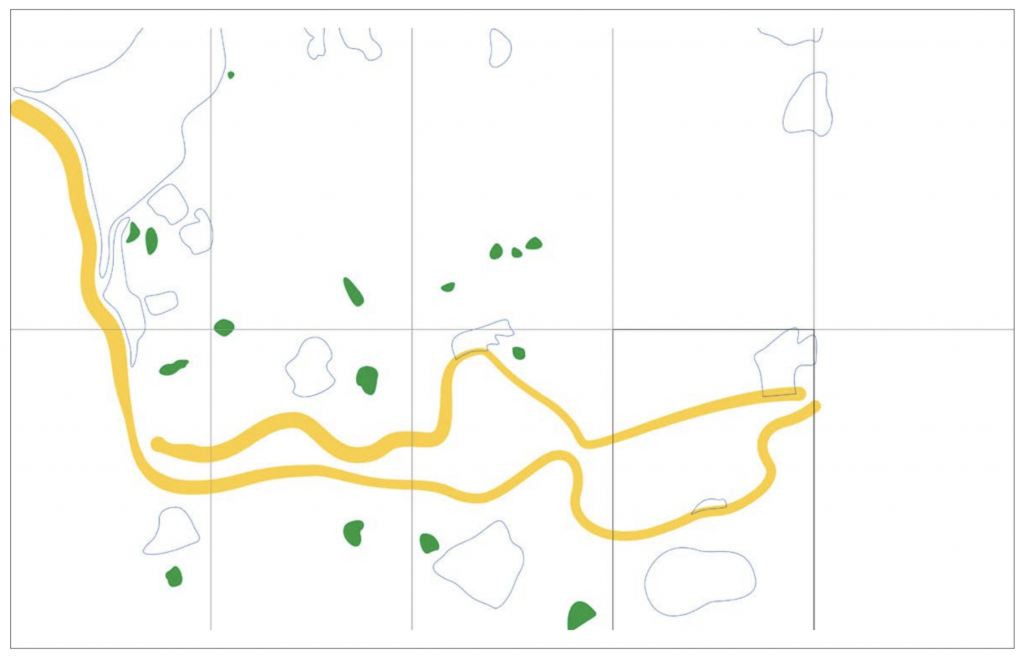
a representation of bristol through it's parks and river
I’ve done this by vectorising these landmarks, which includes primarily the River Avon. This has been spread out to create 10 different backgrounds. As a group, they create this map of Bristols outdoor space but separately they exist as intriguing and contemporary graphic markings, whilst in pairs or trios they connect each of the printed spreads.
When we started getting the artwork submitted there was a clear colour theme across pink, purple, blue and green so we decided to limit the campaign to these colours. Together they're bright and joyful, reflecting this years theme and setting it apart from last years use of black.

abstract lines on pink that represent green spaces in Bristol
